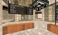
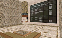
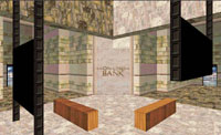
| We made this demo to impress upon an
executive of a large Spanish IT-shop how graphically and experientally rich as well as
intuitive and user-friendly a 3D on-line bank could be made to be. This company had this
big database-cum-electronic-transactions system that they were keen to peddle to banks in
Spain and beyond. The executive was suitable impressed, but apparently their target
customers apparently found the package deal -which would include our 3D interface work- to
be too heterogenous or something... Innovative
ideas of our own demonstrated in this piece of work included: making the user start their
experience right in the middle of things rather than have them come into the bank from
outside (as was the dominant paradigm of that moment as shown in comparable personal
banking interfaces like the one from the late Worlds, Inc.); a circular lay-out of
services allowing the user to access all of these with minimal distance to cover or
navigation to do; a personal parlour where a banking counselor could have a secure
multi-user avatar-to-avatar tete-a-tete with his customer, with all the customers' vital
banking data viewable at a glance; and a stockmarket ticker-tape embedded inside the 3D
space.
Realised in Virtual Home Space Builder. |
 |
|
